How to Fix your Color Contrast
To meet the color contrast requirement, you should have a contrast ratio of 4.5:1 for normal text, and 3:1 for large text (18pt and above, or 14pt bold). Use WebAIM's Contrast Checker or TPGi's Color Contrast Analyzer to make sure that you are meeting the right contrast ratio.
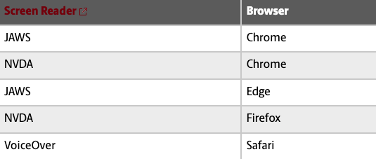
Most text that you write in the CMS has sufficient color contrast by default. Black
paragraph text and garnet headings & links have plenty of color contrast when you
write them on a white background; however, be careful not to add garnet links to dark backgrounds like table headers because
this will cause a color contrast failure.
Images of text with insufficient color contrast may not be flagged by automated accessibility checkers, but you should still always check your contrast ratio for text within images so that it's readable for everybody.